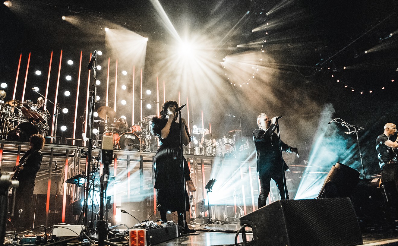
It's been a mostly soggy and groggy week since our last winning POTW announcement. Just look outside: It's beautiful. I'll admit, I'm pretty fond of these dreary days, that's just my style (I could do without the wetness, but hey, I take them as they come).
This week's poster selection is reminiscent of the overcast calm that's been hanging over all of us, in my opinion. Although some might be sick of this weather, and find it aggravating, putting their whole world view off kilter, I think it can put things into a certain perspective that allows us to see the world (or, say, posters) differently. Speaking of being off-kilter, or off-set, I present you this week's winning Poster of the Week selection: Bowerbirds with Julie Doiron and Fox And The Bird, all performing tomorrow night at the House Of Blues in Dallas.
After the jump, I'll tell you why it's a winner.
Designed by Jamie Wilson, designer at the local shop Switch Creative Group, (and member of the band The Beaten Sea),
this dark poster promises that there's more to the forest than just the
trees. The prevailing style here is the rosette pattern, indicative of
off-set printing, where dots of color are combined to create more
colors, ultimately creating the whole image (most commonly comprised of
CMYK, AKA cyan, magenta, yellow, and black).
(Yes, K stands for black.)
If
you ever look at a printed page (that doesn't come from your desktop
printer or a laser copier) with a magnifying glass, or more
appropriately, a loupe, you will see this effect. Sometimes, it can be
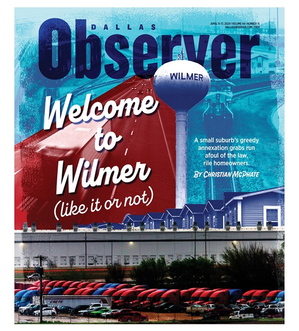
quite pretty. (Editor's Note: See this week's Observer cover for a fine example.)
This effect is generally used in just the right amount, to create
some texture and enough graphic agitation to give a whole other feeling
to this piece, which could otherwise be smooth, and slick. But here we
have something earthy, gritty, and visceral. You can really get a taste
of that with the headliner's name, which is what it would look like if you were
to magnify the same text from, say, a "normally" sized piece of type in
a magazine. The openers are nicely set underneath in clean type,
setting them apart from the main focus, without distracting or taking
away, but providing a sturdy platform. The same is achieved very well
with the info line at the bottom, perfectly balanced with the rest of
the type above.
Overall, I really do like this piece. It's
simple while containing so much detail and emotion. The smudges and
grain cast over the entire piece doesn't even feel like overkill, but
rather the icing on the cake. An organic, graphic, beautiful cake, best
served at dusk.
Keep sending your submissions to [email protected]. And for all of you who claim to see "better" posters out there? Please, send
them in. After all, you've got to play to win. See you next week...


