POTW captain/Dallas Observer art director is under the weather today, the day in which he was supposed to make his triumphant return to the ship after a couple weeks of much-needed vacation. So he's out. And, with go-to replacement Jesse Hughey facing a few deadlines this afternoon, the duty of selecting and dissecting this week's crop of offerings falls all the way down to yours truly. Which means, I guess, that it's high time for me to dust off my GRA 217/218 thinking cap from the ol' undergrad days at Syracuse, and see if I can conjure up an acceptable description to justify this week's selection.
I'll do my best... after the jump.
First off, many thanks to The Fox & The Bird's Daniel Bowman for passing along this week's winner, designed for the band by freelange graphic designer Travis Lawrence to promote its upcoming, Saturday night, AllGood Cafe-hosted affair with Doug Burr.
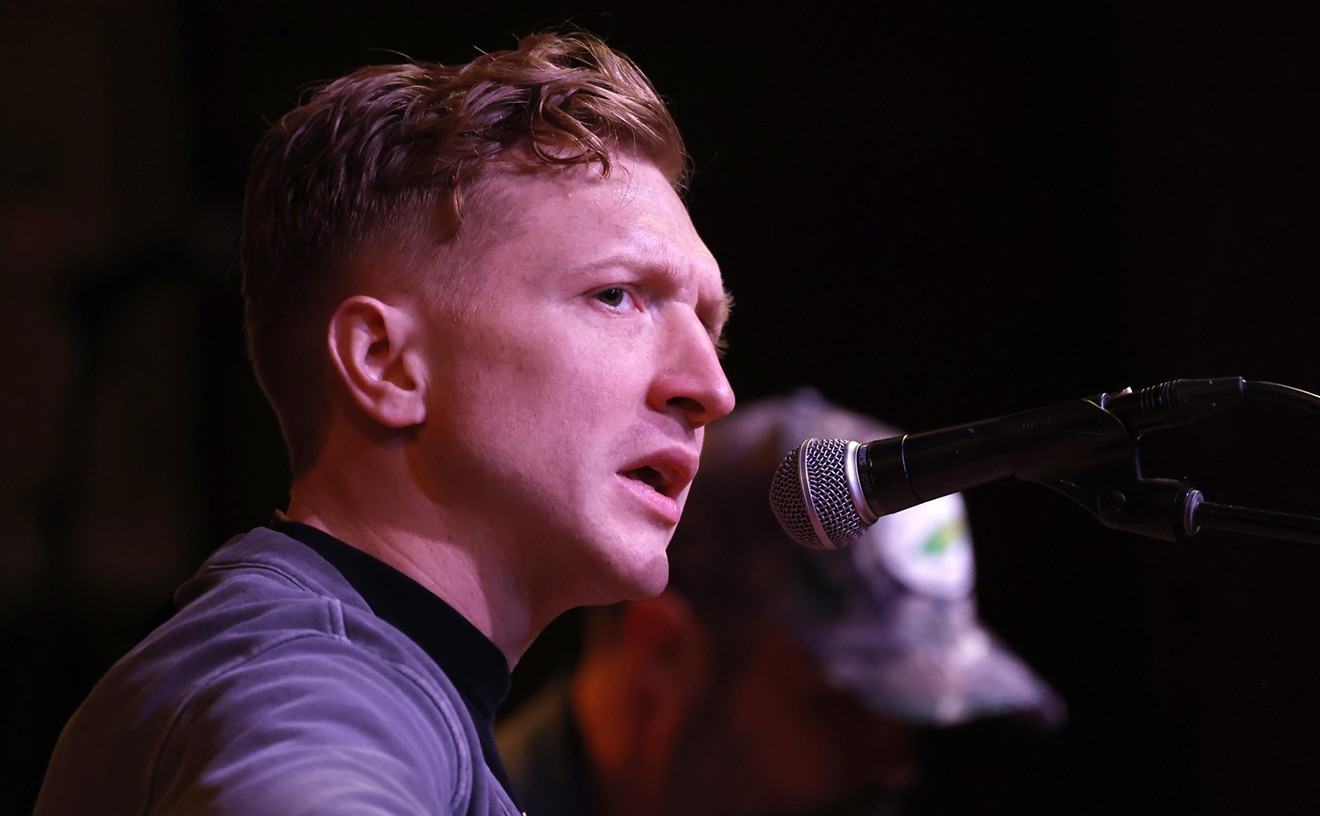
Well, duh, right? Obviously, Burr's the inspiration for this visual here--or, perhaps, even more specifically, it was this shot taken by Brian Harkin for our own publishing purposes back in 2008
that served as the basis for this design. Don't know. Regardless, this poster wins
for its smart incorporation of Burr's visage here, something that
anyone with even a remote sense of the local scene is bound to notice upon
immediate glance.
But it's in the details that this piece
truly shines: From the smart coloring of Burr's--OK, I'll say
it--almost skunk-like hair color and all the way down to his
horn-rimmed glasses, which, quite cleverly, were used by Lawrence as a
means to incorporate the headliner's name into the piece, this poster
wins on every level. And it does so in even the most minute of places: Many of
the same typographical elements used in Burr's name here are kept in
the type used of the bottom portion of the poster--an impressive little
move, for sure. And the colors also make for a nice selection as well,
providing the poster a pleasing, muted tone with which it's vast gray
space has plenty of room to shine, proving, quite capably, that, in
this poster's case, less is indeed more.
So there you go. Congrats to Lawrence on a fine design.
Who needs a drink?


