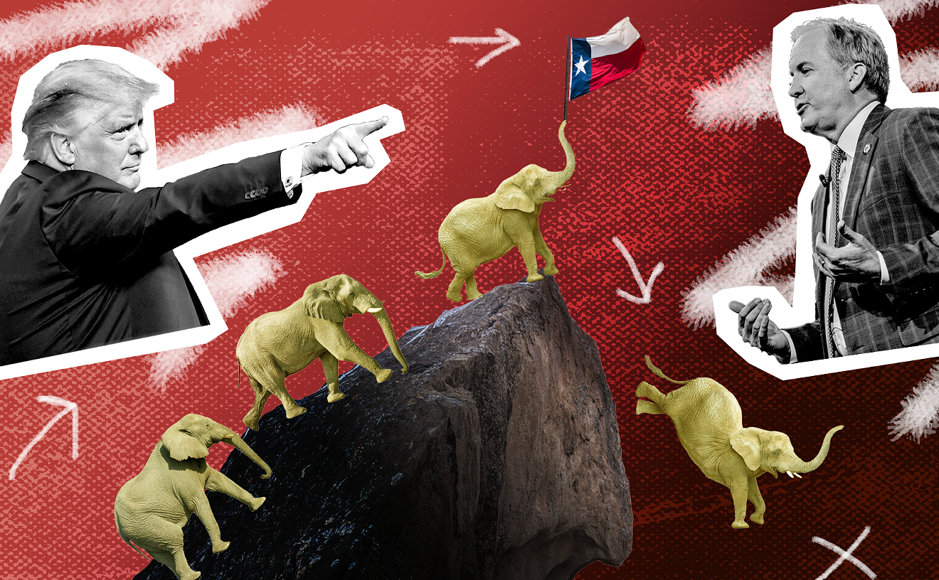
In 1967, back when Helvetica was still brand new, American Airlines recruited Italian designer Massimo Vignelli to develop what would become the carrier's logo for the next 46 years. It was simple, straightforward, and instantly recognizable: a pair of A's, one red, one blue, separated by a stylized blue eagle.
Bloomberg Businessweek caught up with Vignelli last week in the wake of American's announcement that it would be jettisoning his creation in favor of a newer, more modern look.
Suffice to say, Vignelli is not impressed.
"It has no sense of permanence," he told Bloomberg. "The American flag is great. ... But the American flag has 13 stripes, right? Not 11. Did American add only 11 stripes [to the flag on the tail] because they are in Chapter 11? I don't think two more stripes would have been a disaster. And there are only two colors shown instead of all three. So is it a different flag?"
His critiques cut deeper than the new paint scheme, however. The redesign reeks desperation, which marks a stark difference from the process that produced the original logo, when his team "proceeded by logic, not emotion. Not trends and fashions."
"This is the typical mistake that company presidents make: 'I'll change the logo, and the company will look new.' What you have to have is a president who knows how to run the company, and in that process knows how to evaluate the brand identity," he said. "Otherwise it becomes a wolf camouflaged by sheep. It's still the same company that's not going to be successful. They're not going to solve their problems, they're just going to increase their costs."
We also get the tidbit that the eagle from the old logo? Not Vignelli's idea.
"They wanted an eagle. I said, 'If you want an eagle, it has to have every feather.' You don't stylize and make a cartoon out of an eagle." So, "I'm not sorry to see the eagle go."
(h/t Dallas Business Journal)