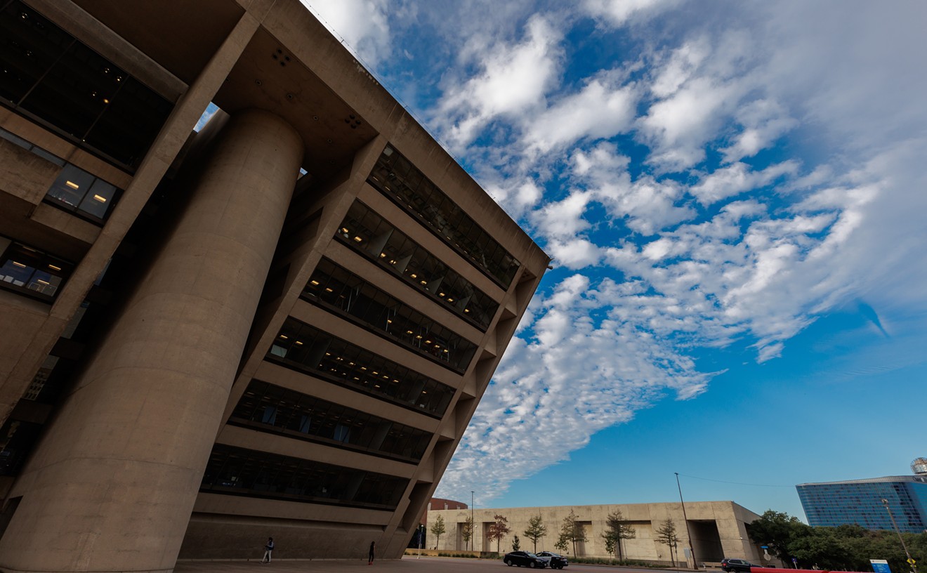
A lot of things have changed in Dallas in the past 40 years -- just look at the skyline or Uptown or the exploding suburbs -- but not everything. I was reminded of that this morning by the city's Facebook page. There, spokesman Frank Librio posted a brief history of the emblem you see above.
"I manage the City's FB and Twitter pages... so I'm always looking for interesting factoids to post in between service alert and event postings," Librio wrote in an email this morning. An employee asked him yesterday if he knew the history of the stylized blue "D" that graces just about everything that emanates from City Hall, so he checked with city archivist John Slate, who had recently compiled the information.
The logo was designed by Crawford Dunn and Associates and, as city records describe it, "is a blue capital letter 'D' with a green stylized tree inside it is meant to be simple, uncluttered and modern. The 'tree' is meant to symbolize the quality of living in Dallas, and also to project a feeling of greenery, growth and concern for the environment." It was first used on a presentation of the 1972-73 budget on August 10, 1972, which by my calculations means it will turn 40 in just over a month.
I asked Librio if there was a birthday celebration in the works, maybe a D-shaped cake and ice cream at City Hall. I was also curious if there'd ever been talk of replacing the logo. Those questions weren't addressed, so I'm assuming no. Which is probably for the best. The design is a far cry from "modern" and the symbolic tree might be best interpreted as a fig leaf, but the logo is at least inoffensive and carries a proper air of bureaucracy. Better to stick with it rather than pay a design firm hundreds of thousands of dollars to come up with something new that everyone but the design firm agrees is terrible.