
Adobe Stock

Audio By Carbonatix
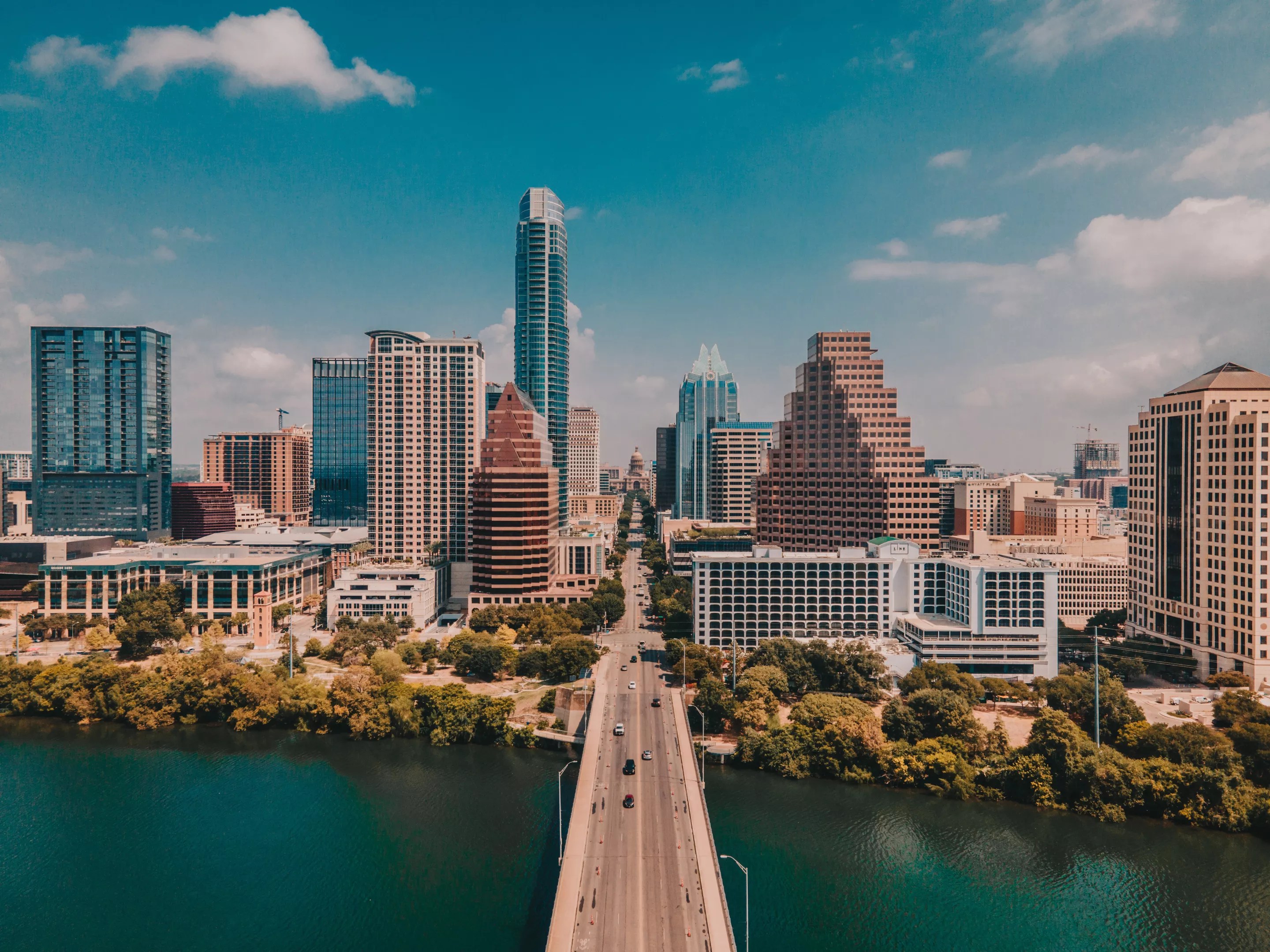
T.C. Broadnax is on a roll down in Austin.
Just one month after Dallas’ former city manager took some heat for spending several thousand dollars on his Sweetgreen salads habit, Broadnax got to stand front and center for the unveiling of Austin’s new city logo. This new logo has been in the works since 2018, so the initiative was launched far before Broadnax’s tenure as Austin’s top dog began. Nonetheless, when future Austinites look back at photos of the day their city crest was sterilized, they will see Broadnax as the messenger.
At least we got a tree. (That is a tree, right?)
City of Dallas
To put it plainly, Austin’s new logo sucks. If there was any question as to whether the “Keep Austin Weird” era has ended, look no further than the unimaginative blue and green swoopy “A” that now defines city management. Austin city leaders say the logo is meant to “reflect the hills, rivers and bridges” that define the capital city.
As noted by many a social media user, the logo is strikingly pharmaceutical-esque. When I see it, a fast-speaking voice begins playing in my head saying, “Visiting Austin may cause side effects such as nausea, dizziness or even death. Do not visit Austin if you are allergic to Austin. Let your doctor know if you plan to step inside Austin city limits while pregnant or trying to become pregnant.”
Go @dallasmavs ! pic.twitter.com/5MhcVclLkw
— 🇺🇸JohnyBotðŸ¦ðŸ‘ (@Johnyalamo) September 4, 2025
What is especially funny about this situation is that, after shelling out an estimated $1,117,558 on this logo redesign, the new Austin “A” looks a whole lot like Dallas’ three-lined “D.”
“I have rarely seen Republicans and Democrats united on any issue quite like this, but there is outright condemnation of this logo. Because the logo stinks. It’s a ripoff of the Dallas logo,” Adam Loewy, a personal injury lawyer whose highway billboards are more representative of Austin than the new logo, said on social media Friday.
One city of Austin employee, Patrick McDonnell, wrote on X that he likes the new Austin logo “even more” after seeing it compared to the Dallas Mavericks’ iconic city jersey. The letters on the retro jersey do have a similar swoopy effect as the Austin logo, and an identical color scheme. (“MFFL,” McDonnell added, evidently unaware that we are still mad at Nico and aren’t doing that right now.)
“The new Austin logo has hints of the classic Dallas triple D and similar color scheme, but is that a bad thing?” He posted. “Loving the connection. Please Dallas my Austin!”
The new logo has opened Austin up to an all-time level of clownery on social media, although not all the commentary is laugh-out-loud funny. (To the user who changed the logo into the “Papayrus” font – that was funny.)
I swapped Austin’s new logo into the unofficial city font Papyrus as a joke… but why do I kind of like it better??? https://t.co/0jz6V47M3b pic.twitter.com/HURJGZE1Yw
— emily (@AaahhRealEmily) September 5, 2025
Some have remarked that the blue swoop that splits through the logo’s green “A” is a likely unintentional but on-the-nose reflection of how highways have been used to divide the city. That’s the kind of thing that could have been pointed out ahead of time, if city leaders had involved the community in the process of rethinking the city’s branding.
Digital media will begin displaying the Austin “A” on Oct. 1, but a full rollout of the logo will take a couple of years. It takes time and money to put stickers on cars and shirts and stuff.
In the meantime, if any other Texas city has a million bucks to spend on a new logo design, call me. The job looks easy enough.
Happy Friday y’all, may your day be as easy as the new City of Austin wordmark. pic.twitter.com/fSva99x1V0
— Brody Vercher (@brover) September 5, 2025