
Flickr User Mr. Hernonymous via Wikimedia Commons

Audio By Carbonatix
Sports and fashion were once totally separate institutions. For better or worse, that is no longer the case as the influence of marketing and music impact what athletes wear. Fashion has been as fickle a mistress in Dallas’ sports scene over the years as in any arena. Now that we enter one of the sports calendar’s lulls, let’s take a look back at some of Dallas’ sports most runway-ready ensembles, and some that were better left on the shelf.
The Good
1. 1981 Mavericks Classic Green
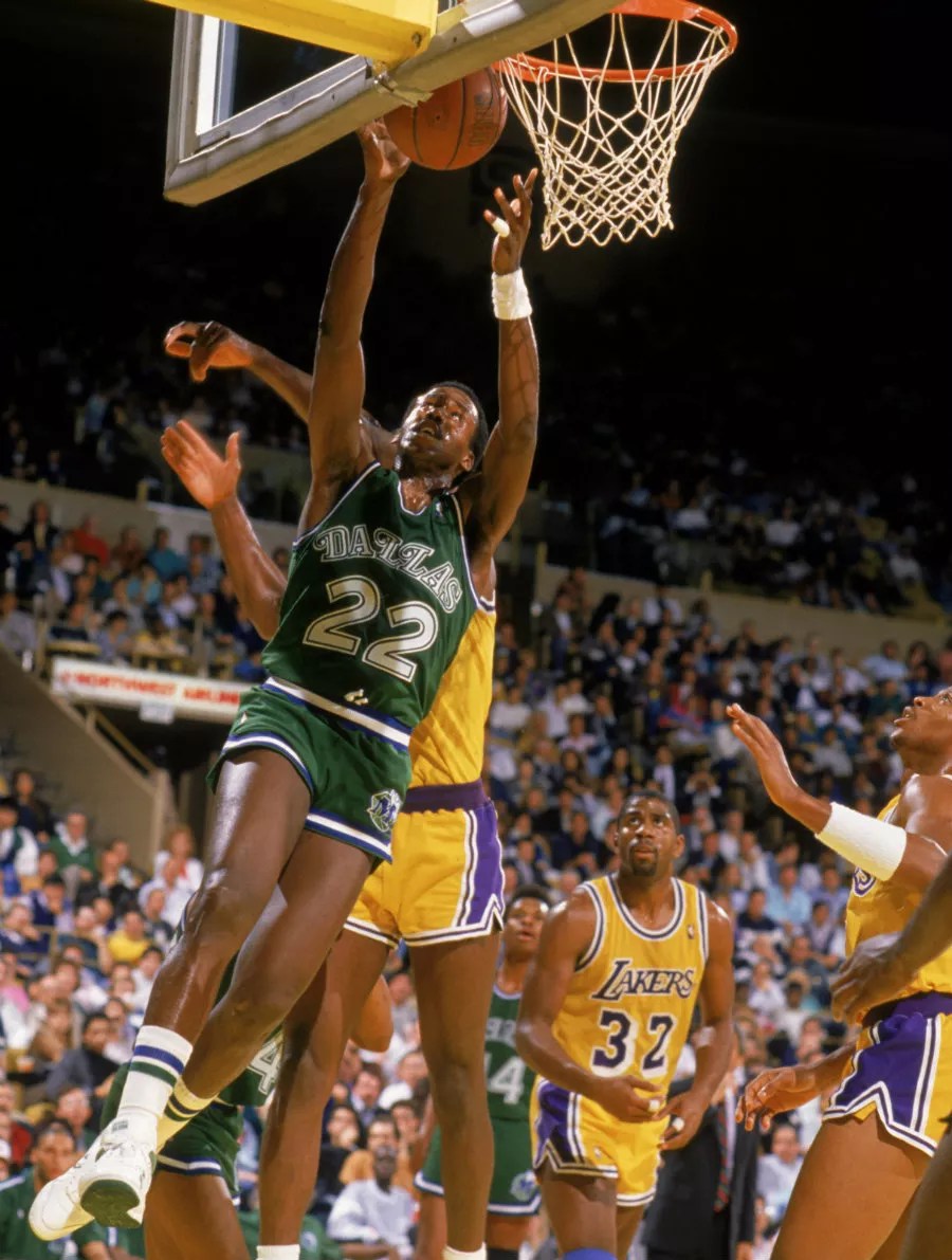
Bring back short shorts, and the ‘M’ wearing a cowboy hat.
Courtesy Dallas Mavericks
In the 1980’s short shorts and striped socks ruled the basketball court, and the Mavericks had one of the boldest uniforms in the game. Rolando Blackman, Brad Davis Derek Harper and Sam Perkins modeled the Mavs’ greens back in a time when the team’s ‘M’ still donned its 10-gallon hat, before the western motif was deemed poisonous to jersey sales.
2. Texas Rangers Whites, 1984 through the early ‘90s
It’s hard not to let sports nostalgia seep into uniform evaluation. By God, Nolan Ryan threw fireballs in these simple, balanced uniforms with the cursive lettering spelled out “Rangers” instead of “Texas,” while a future U.S. president watched from the owners’ seats. The hat countered with a slightly updated block T from the 1970s uniform in a nod to the past.
3. Current Dallas Cowboys
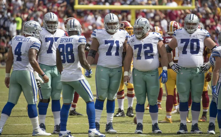
Don’t quibble. This is what America’s team looks like.
Keith Allison
Haters will point to the disconnect of having navy blue stars on helmets and royal blue accents on the jerseys. They’ll point to silver pants that come off as aqua, sometimes even green, depending on the lighting. Don’t listen to them. This is what America’s team looks like.
4. Fort Worth Fire
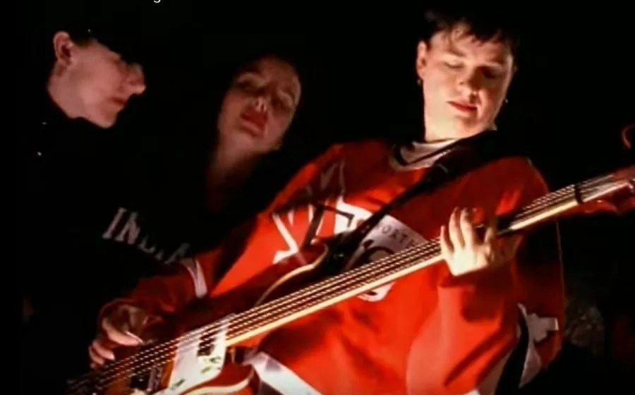
Former Toadies bassist Lisa Umbarger sports the classic Fort Worth Fire red.
Screenshot from Toadies’ Possum Kingdom music video
The Fort Worth Fire, a Central Hockey League team, had the coolest flame logo this side of the United Methodist Church. And they never beat you over the head about it, like hot rod culture does. Just a solid red or white, with some horizontal striping and enlarged lower-case lettering, and call it a day.
5. Dallas Cowboys 2016 Color Rush
Color Rush Dec. 1: Cowboys (white) at Vikings (purple). pic.twitter.com/wl0wwWkXAL
— Paul Lukas (@UniWatch) September 13, 2016
The NFL’s “color rush” campaign during the 2016 season made most teams look just plain silly for a game. The Cowboys actually came out of the “color rush” fiasco unharmed, though. While the Vikings played in Barney the dinosaur costumes during their Thursday match-up in December, the Cowboys were clean in all-white.
The Bad
1. 2003-2006 Stars “Mooterus” Jerseys

Sergei Zubov dons the infamous Mooterus Dallas Stars jersey, which was an alternate uniform worn 2003-2006.
The Score
The “Mooterus” phenomenon coincided with the tragic mistake on behalf of the Stars franchise to try to add a dash of red to the team’s color scheme. They also went away from the star as the primary logo with this one, something of a departure for a team named the Stars. Connecting Taurus’ constellation points on the front of the jersey brought hockey fans with their minds in the gutter back to high school health class and diagrams of the female reproductive system, hence the “mooterus” nickname.
2. 1995 Cowboys‘ Barry Switzer Blues
So 1990s it hurts. So 1990s, these Cowboys unis may as well have been designed by Umbro.
3. 2003 Mavericks‘ Tin Foil Look
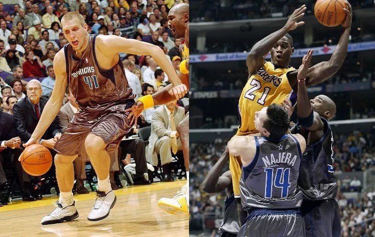
Things were going so well for the Mavericks on the uniform front in the early 2000s. Then this happened.
Courtesy Mavs Moneyball/creative commons
These 2003 Mavericks disasters are why silver is best left as an accent color. The players look like aliens from a cheap 1950s sci-fi movie.
4. 2005-2008 Rangers Sweater Vests
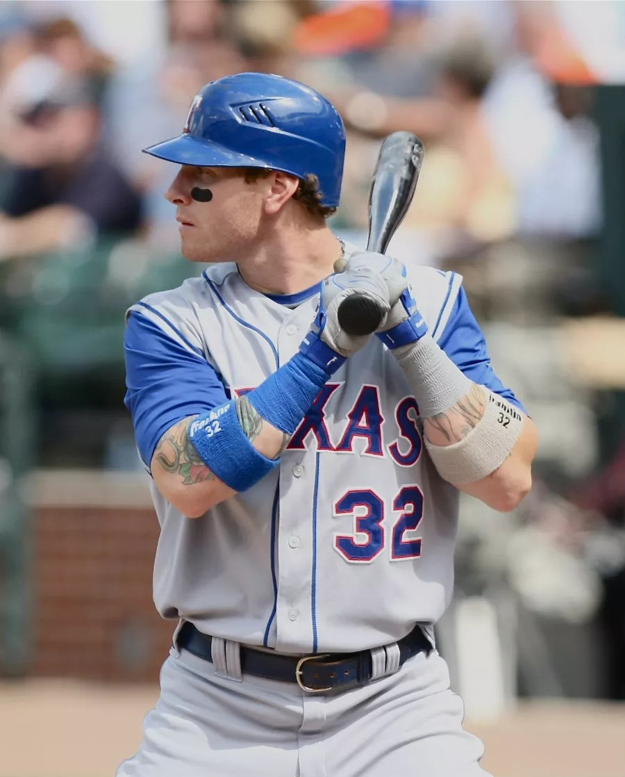
The 2005-2008 Rangers sleeveless jerseys are the baseball version of wearing a sweater vest with a white T-shirt underneath it.
Keith Allison
Never show up to a party in a sweater vest on top of a white T-shirt. While we’re at it, never show up to a baseball game in this either.
5. 1996-2000 Dallas Burn Gear
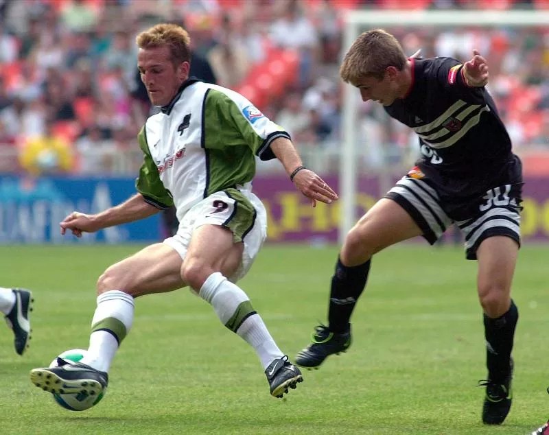
Burn your Dallas Burn gear.
Wikimedia Commons
Geometry need never factor into why a sports uniform is either bad or good. In this case, the square of the hypotenuse is equal to the square of the sum of the other sides, which unfortunately convene in this player’s armpit. There’s a red number similar to this kit from the 2000 season that may be even worse. We’ll spare you and settle on this oddly patterned green monstrosity.