
Jennifer Crenshaw

Audio By Carbonatix
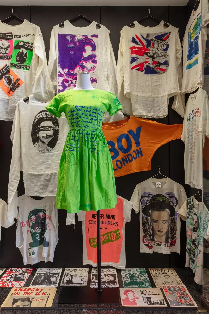
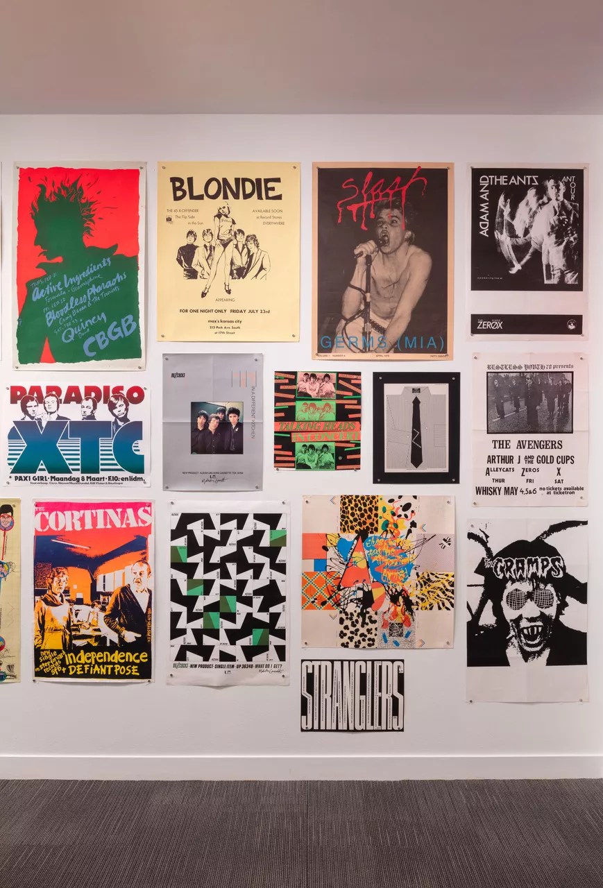
Judging from the overstuffed cases in Southern Methodist University’s current exhibition Torn Apart, there’s a solid argument for not throwing anything away. Subtitled “New Wave Graphics, Fashion & Culture 1976-1986”, the collection of posters, Vivienne Westwood garments, club fliers, stickers and buttons is a lifelong labor of love gathered by scholar Andrew Krivine.
Displayed through May 10, in the Hawn Gallery at the Hamon Arts Library, the cases of colorful ephemera also include some seriously iconic fashion from the wardrobe of graphic designer Malcolm Garrett, the recipient of honors such as The Most Excellent Order of the British Empire and Royal Designer for Industry.
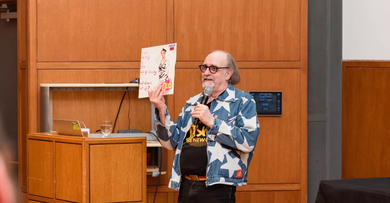
One might accuse Krivine and Garrett of being pack rats, but they have undoubtedly chosen the right rats to pack. Garrett, who was in town for a panel discussion and a talk in conjunction with the show’s opening in February, says he prefers the term “collector.”
“I’m just somebody who likes the heritage of things and doesn’t like to throw things away,” he says. “I’m a completist – if I like an author, I’ll read every single one of their books. If I like a band, I have to have every record. Andrew is like that; he’s been collecting posters and ephemera for years and years and years.”
In the middle case on the left, visitors will even find the handbill for that legendary Sex Pistols show at the Longhorn Ballroom, a site Garrett was thrilled to tour when he was in town. His partner in fandom, Andrew Krivine, first became enamored of the Pistols as a teen helping out in his cousin’s boutique, Boy London, on King’s Road.
By the time Krivine was an adult, he was ready to examine punk through a graphic lens with the first exhibition of the most extensive private collection of punk and post-punk graphic design, at the Cranbrook Art Museum in Michigan in 2018. Having met Garrett through the punk photographer Sheila Rock (whose work is also displayed in Torn), he brought the graphic designer along for the next iteration at the Museum of Art and Design in New York in 2019, an occasion for which Garrett designed a poster and a book cover.
“The outcome is that Andrew published a book titled Too Fast to Live, Too Young to Die, and that book is in the SMU library,” Garrett says. “We became firm friends because we had the same outlook about what we like, what we like to keep, and what we share. Andrew learned I’d been keeping my clothes as best I could, which is why I’ve got key pieces that were important to me, but not vast amounts, because we were all on a budget. A lot of clothes I bought I bought for girlfriends, and when they left, they would take them, so I learned to hold onto things!”
Garrett’s treasures on exhibit include an original Westwood Seditionaries bondage jacket, multiple open-weave punk sweaters and some very naughty T-shirts, including the iconic “Two Cowboys” Westwood shirt, which also resides in the Metropolitan Museum of Art collection. The latter item is subtly censored under a leopard-trimmed drape jacket.
Curated by CalArt’s Michael Worthington, Torn Apart also displays Garrett’s original poster designs, including work for Magazine, The Members and the Buzzcocks.
The path to defining punk and new wave through visual design was almost predestined for Garrett. In his six-person class at Manchester Polytechnic were fellow designers Peter Saville (New Order, Joy Division) and Keith Breeden (Scritti Polittl, ABC). Together, the three helped shape an entire generation equally enamored by boys in eyeliner and modernist graphics.
The punk and post-punk exhibition at SMU is full of badass ephemera.
Kevin Todora
“We had a sort of internal arrogance that what we were interested in was superior,” says Garrett. “We knew more about what was going down in the general commercial world and what we didn’t like and were driven by.”
An intense prog-rock fan, the teenage Garrett was as inspired by the graphics on the albums of Hawkwind, his favorite band, as by what Andy Warhol was creating for the Velvet Underground. Side by side with those influences was the German electronic movement of Krautrock and bands like Tangerine Dream, Can and Neu. This mishmash of English and New York pop-art scenes and the emergence of glam inspired Garrett to pay closer attention to the details on his favorite record sleeves.
“I remember buying [The Rise and Fall of] Ziggy Stardust and the Spiders from Mars, and thinking, ‘The typesetting on this is terrible! I could do a better job,'” he says while laughing. “That was the subject of most of the conversations Peter and I had, that we could do a better job than the sleeves you’d see from some of your favorite bands.”
While contemplating bad typesetting, Garrett found himself in the orbit of the Buzzcocks (a spikily melodic band formed in the wake of the Sex Pistols) via one of their entourage, feminist artist Linda Sterling.
“Linda, being Linda, became acquainted with the lead singer Howard Devoto and became his girlfriend,” Garrett recalls. “She was an illustrator, and when they were asking her to do graphics stuff, she said, ‘I don’t want to be a designer; why don’t you talk to Malcolm?'”
As the Buzzcocks didn’t yet have a label, Garrett initially got to work screen-printing posters to promote local gigs. By the time the band signed with United Artists (on the day Elvis Presley died), he was already primed to create the graphics for the first single, “Orgasm Addict.”
This jump-started a career where Garrett acted as the fifth band member, drawing a thread through each subsequent sleeve or flier to define their aesthetic. By blending Bauhaus and Russian constructivist thinking with bright, hard colors and sans serif type, he created a “high tech” design that felt fresh and new.
“For me, it was pop art wrapping pop music and punk being an art movement like Dada,” Garrett says. “I just woke up one day and realized the real contemporary Dada is happening around me, and it’s called punk. As soon as that clicked, I was like, ‘Fuck. This is my destiny as an individual and a designer-stroke artist.’ It was punk rock, but more than that, it was the Buzzcocks.”
As Garrett worked for the band, other so-called “new wave” groups began popping up all over England like mushrooms after a rainstorm: Gang of Four and the Human League in Leeds, the Tear Drop Explodes and Echo and the Bunnymen in Liverpool, and Penetration in Newcastle. Gang of Four manager Rob Warr had just landed a plum job at EMI when he made a call that solidified Garrett in the pop culture pantheon for life.
“He said, ‘We’ve just signed this band, and they’re going to be fucking huge. Would you like to come to see them?’ And that band was Duran Duran,” says Garrett. “They saw their influences as a mix of Sex Pistols and Chic, and a lot of the critics didn’t really get why I [was working with them], but they were just visionary. I was able to develop and expand the visual environment of a band beyond the record sleeve into an entire sphere – on a totally global scale.”
During his talk at the SMU, Garrett shared many interpretations of his cover of the classic Duran Duran album Rio. With drop-shadowed and slanted type superimposed on a femme fatale, made by artist Patrick Nagel, the cover exemplifies the glamorous 1980s in all its neon glory. More than any other of Garrett’s works, fans approach him about Rio to this very day. Yet he says he didn’t design it, or any other cover, to show off his aesthetic. Nor are his designs there to make the band look good – be it for Duran Duran, Simple Minds or Culture Club. Instead, Garrett says his work always has been and always will be for the fans.
“It’s my natural belief that my job is not to create a nice little canvas for my ideas but to create an environment that is not even belonging to the band but belonging to the band’s audience,” he says. “Once it’s gone on a piece of paper and that sleeve for Rio is done, it belongs to the fans; it’s theirs in the same way those Hawkwind sleeves belonged to me.”
This intuitive approach has since brought Garrett work for a myriad of clients and genres. Among the projects he showed during his lecture was a totally ’90s site made for the Spice Girls, as well as clever designs for the U.K. border passport queue and city maps kiosks scattered across London.
“It’s all about understanding the user journey and realizing that, as a designer, you’re just a mediator,” he says. “Somebody has a message, and that message might be, ‘Her name is Rio,’ or that message might be, I’m trying to find Selfridges on Oxford Street. I just sit in the middle between the message and recipient.”
Currently, Garrett continues this methodology through work for the band Feral Five, as well as doing merch for the global tour of famous English scientist Brian Cox. But he finds his most satisfying projects are community-oriented, like an “Art School in a Box” he devised during the pandemic, and his work as an ambassador for the Manchester School of Art.
Peppered with attention and autograph requests at the Torn exhibition, Garrett was pleasantly surprised to see so many young people interested in what he had to say. To them, he suggests the most important thing is always remembering what is being communicated: information first, aesthetics second.
“Listen, read, think, ask questions,” he says. “Have a listen as to why did the client say that, then you can go back with a better way of saying this. You have to develop that relationship of trust in one another, and that takes a while. That’s why I like working with bands for a long period of time. You get to know one another, know what those people are all about, and they come to trust you. You build the relationship and that trust, and you have fun!”
As the digital spaces of Instagram and TikTok become as crucial to a band (or brand) as advertising, web design and merchandising, Garrett suggests designers at all levels explore how a central message can evolve differently for different spaces.
“As a designer, you’re a communicator, you’re a mediator, you’re a filter,” he says. “So, the same information may be presented in slightly different ways based on where it’s being communicated. As a designer, you need to have the flexibility to move between spaces; it’s all about mediation. The media is the mediation.”
Torn Apart: New Wave Graphics, Fashion & Culture 1976-1986 at the Hawn Gallery, in the Hamon Arts Library, 6100 Hillcrest Ave., is free and open to the public. Hours: Monday – Thursday, 8 a.m. – 10 p.m.; Friday, 8 a.m. – 6 p.m.; Saturday, noon – 5 p.m.; Sunday, 2-10 p.m.
The exhibition lets visitors take home a cool promotional poster.
Kevin Todora